
Six Real Klaviyo Templates And The Logic Behind Each Block

A cart email and a cancellation email share a logo and almost nothing else. One is trying to close a sale that nearly happened, and the other is trying to end a relationship well enough that it might start again.
Yet most brands reach for the same Klaviyo email templates for both jobs, then wonder why one of them lands flat.
We are Email Kong, and we run the retention programs behind more than $58.2M in Klaviyo Attributed Value as one of a small group of Klaviyo Master Platinum Partners. Every email below is one we designed and shipped for a real DTC brand.
We have pulled six apart to show you the decisions we made in each one, block by block. Not the theory. The actual calls, and why they moved the numbers they did.
When we start a build, the job of the email comes before anything visual. Once we know what an email is for, the order of its blocks stops being a matter of taste and becomes close to obvious. It is the logic behind every program we run in Klaviyo.
Read on and you will be able to hold your own sends against six we built to sell, and see what every block is there to earn.
The cart email removes one doubt
Our goal was to win back a sale the customer had almost finished, without letting a discount become the whole reason they came back.
Someone fills a cart and then leaves. By the time this email lands they have cooled off, so we were not trying to sell the sunglasses again. We were trying to make finishing feel effortless.

What we left out, and why
So our first decision was what to leave out: no product grid, no carousel of other styles, no second offer.
We kept it lean, with a logo above one cropped hero image of the sunglasses. Then a headline, three short lines and a single button.
Abandonment is a decision that was almost finished, and the fastest way to lose it is to reopen it. If we had dropped in three more products, we would have handed the customer back the exact choice that made them leave.
A cart email should send someone back to the decision they nearly finished, not reopen the one that lost them.
The line that removes the doubt
We wrote the headline as a soft question rather than a command, and that was a psychological call, not a stylistic one. A line like complete your purchase reads as pressure, and it admits how closely you are watching.
A cart email already carries a little embarrassment, because the customer knows they bailed. So the line we leaned on is the aside in brackets, telling them there is no judgement and the items are just sitting there.
That one line takes the sting out of coming back, and the sting is the real barrier here, far more than price.
Why the incentive sits at the bottom
Then we sent them straight to a single call to action, back into a decision that is ninety percent made. One CTA button, one destination, nothing else pretending to be helpful.
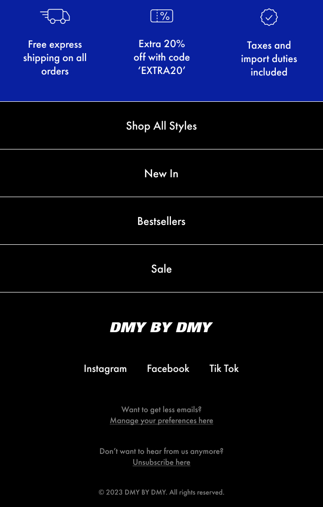
We put the incentive strip underneath that button on purpose. The free express shipping and the discount code sit there, and that placement is the whole strategy.
Lead with a discount and you teach your best customers to abandon deliberately, because they learn a coupon always follows. We did not want to train that behavior.
So we set the incentives below the ask, as reassurance rather than a bribe, where they clear the shipping and hidden-fee worries behind most abandonment without becoming the reason to return.
The post purchase email earns the second ask
Our goal here was not another sale. It was to keep a brand-new customer taking the product every day for a month, because this is a supplement that only works if they stick with it.
Because the sale is already done, the customer owes us nothing. That is the problem every post-purchase flow has to solve, and we solve it by giving before we ask.


Why the progress bar comes first
We opened on a guarantee bar and a progress tracker reading Day 9 across a 30-day scale, before any headline. That order was deliberate.
The tracker tells the customer exactly where they are in a routine they have already started, which is information they genuinely want. We put it first because it earns the attention the rest of the email then spends.
We sell the habit, not the bottle
Only after that does the headline give them a reason to keep going, and we made sure the product is not the subject of that sentence. The habit is.
We wrote it that way because a customer nine days in does not need to be sold the bottle they already own. They need a reason to take it again tomorrow.
The whole email is built to protect the routine, because we know the second purchase only comes when the first one truly works. That is the number we are managing here, not the click.
The account email sets expectations
This is the email nobody designs, and it is the one we would point a new client to first. Our goal was to end a canceled subscription well enough that the customer might come back, and to learn why they left.


We accept the decision first
By this point the customer has canceled. Most brands treat that as a fire and open with a discount, which tells them their loyalty was only ever worth a coupon.
We took the opposite decision. We accept the cancellation in the first line, then do the one useful thing left, which is tell the customer exactly what happens next.
It is one principle from the wider retention program we rebuilt for KittySpout as they scaled past half a million customers. Across that whole program, Klaviyo now drives 46% of their attributed revenue.
A cancellation email has one honest job. Tell the customer what happens next, then get out of the way.
Answering the questions they already have
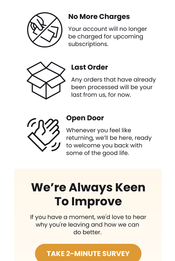
That done, we used three blocks in the middle. They cover the end of charges, the last order and an open door, and each one answers a question the customer is already holding.
When the ask finally comes, we made it a two-minute survey rather than a sale, set in its own tinted block so it does not muddy the message above it.
Why we left the discount out
We left out the product grid and the winback flow discount on purpose. That restraint is exactly why the door this email leaves open is a real one.
The offer email makes the deadline real
Our goal was to sell gift cards. That means cash today plus a customer who comes back to spend it, with one obvious objection standing in the way, so we designed the whole email around beating it.


The stack that converts
We led with the offer, then a live countdown timer. The button comes last, and the order is deliberate.
That timer is not decoration, because it turns an abstract soon into a number the customer can watch move.
Removing the one objection
Then comes the block we built the email around: a single line telling the customer they do not need to gift the gift card.
A gift-card offer carries one obvious objection, which is that the customer does not want to buy a present. That one line removes it, and opens the offer up to everyone on the list rather than just the gift-buyers.
Where we put the guarantee
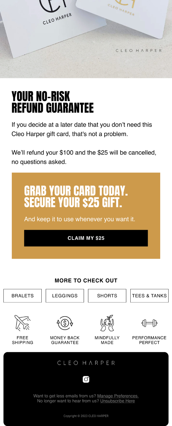
Put the risk reversal where the doubt is. A guarantee in the footer is decoration.
So we placed the refund guarantee directly under the ask, promising the money back with the credit canceled and no questions. That is the moment the hesitation arrives, so that is where we put the reassurance.
There are four buttons and one offer, and we kept it that way on purpose. Because the offer never changes between them, each repeat reads as another chance to say yes, not another decision to make.
The advice email sells nothing on purpose
Our goal with this one was trust, not a sale. We wanted the brand to be the person you ask when you do not know what to buy, because that is who you buy from later.


Opening on the worry
We opened on the reader's anxiety rather than a product. The headline asks how to choose the right flowers, and the sub-line admits the choice can feel high-stakes.
We named the worry instead of a product category because that is what gets the rest of the email read. Nobody reads a catalog, but everybody reads the person who understands their problem.
Advice by situation rather than catalog
We built the body as four rows sorted by the reader's situation, not by our range. Go classic when the message is timeless. Go seasonal when you want to feel current, and mixed when you are not sure.
Organize advice by the situation your reader is in, not by the catalog you happen to sell.
How a no-sell email pays off
We saved the best line for last, telling the reader to match flowers to the moment rather than the person. It resolves the exact doubt the headline raised, and only then do we offer a soft prompt to shop the bestsellers.
We measure this one on the revenue it assists later, not on the click it gets today. The email earns its place by being useful first, and the sale follows from the trust.
The selector email answers which one is for me
Our goal was to stop a customer stalling. When a range has three near-identical versions, the choice itself is what kills the sale, so we made that decision for them.


One fixed axis for the decision
We built the email as a spec grid, and the discipline is in its consistency. Every card carries the same three attributes in the same order.
They cover the level, the feel and who the product is best for. That sameness is the design. We wanted the customer comparing three values across one fixed axis, a decision the eye can make in seconds.
Removing the fear of choosing wrong
We closed on a line promising a version that fits wherever they start, because the fear we were removing was choosing wrong. We did it without a discount, because the barrier here was confusion, not price.
The design rules underneath all six
Two weeks ago Klaviyo moved Composer, its new AI marketing agent, into public beta (reported by DigitalCommerce360 on 1 July). It will build a whole campaign for you in one go, which makes knowing what good structure looks like more important, not less.
Someone still has to judge whether what it produces will really sell. Six jobs gave us six block orders, and underneath all of them the same four rules keep surfacing across every piece of email design we ship.
One email, one ask
We count the distinct asks in every campaign before it goes out, because more than one means the email is competing with itself.
A single offer repeated across a few buttons is fine. A campaign that stacks a percentage off, a bundle deal and a six-product grid is carrying three asks at once, and we have watched that email underperform one that carries a single ask every time.
Visual hierarchy that survives a thumb scroll
Most of a list reads on a phone, at speed, with one thumb. So we design the visual hierarchy to work as a shape before it works as a sentence.
So our test for that is simple. We blur the email until we cannot read a word, then check whether we can still tell what the customer is meant to do.
Passing that test is why a progress bar works and why a wall of body copy at 600 pixels of mobile width does not. Whitespace does the separating and contrast does the pointing, and good email template design earns its most important block a place above the fold.
Proof placed where the doubt appears
We treat social proof at the bottom of an email as decoration. Set that same proof beside the hesitation and it becomes persuasion.
We proved that in the gift-card email, where the refund guarantee sits directly after the ask, because that is the millisecond the doubt arrives. Move it to the footer and the email loses most of its power while looking almost identical.
Designing for dark mode
Dark mode is where a lot of good design comes apart, so we design for it from the start. Litmus has tracked it across roughly a third of opens and rising (its dark mode guide), which makes it a normal reading condition rather than an edge case.
So we treat the failure as a design problem, not a technical one. A maroon brand color can come back pink, and a text block can invert while the logo behind it does not. Klaviyo's guidance on dark mode design is worth reading before you pick a palette rather than after.
We reach for a hex code rather than RGB, since some clients force-invert RGB values, and we give logos a transparent background so they do not sit in a white box on a dark canvas.
Dark mode behavior splits by client, and not the way most people assume. Gmail is the invasive one, running a full color invert that flips dark backgrounds too, while Outlook only partially inverts the light areas.
Apple Mail leaves the email alone until it finds dark mode meta tags, so the client your designer tests on is often the one that changes least.
Whether we work in the drag-and-drop editor or drop in an HTML template built from saved blocks in the template library, we check the rendering across all of them before anything ships, inside our email marketing automation service.
How the same template changes by vertical
None of these six structures is a universal law. The buyer decides how much proof a block needs and how early it has to appear, which is why the same Klaviyo email templates can carry one brand and sink another selling something almost identical.
When the email has to prove before it sells
Batana oil is a category full of counterfeits, so the audience arrives having already been burned by somebody. We knew a standard promotional order would fail there, because the customer does not believe the claim long enough to reach a button.
So when we worked with Kuri Nüka, we built the program education-first and answered the doubts at the exact moment they surfaced, before any offer arrived. Returning-customer revenue rose 350%.
It is the same six types of email, in a different order, because we had to land the proof before the pitch.
Flip to a design-literate buyer and we invert it again, leading with an idea and letting the product arrive as the answer rather than the announcement. Even a welcome flow changes shape between those two brands, and so does a transactional email.
Where a Klaviyo partner fits into template work
You can audit your own block order against the six examples above. Judging your own rendering is harder, because a template always looks right on the machine it was built on.
That gap is what our free Klaviyo audit closes. It is a teardown of your account rather than a report on it, and the design of your Klaviyo email templates plus their dark mode rendering sit on the list of what we check, alongside flow gaps and segmentation. The full scope lives on the audit page.
We have delivered more than 500 of them. Agencies typically charge between £500 and £1,500 for an audit at this depth. We would rather show you the work than describe it.
FAQ
Can you upload your own HTML template to Klaviyo?
Yes. Klaviyo accepts custom HTML, and the template library holds it alongside the built-in layouts.
Custom HTML gives you more control than the drag-and-drop editor, and it also makes every future edit harder for whoever inherits the account, so it is a trade worth making on purpose rather than by accident.
How many email templates does Klaviyo have?
The built-in library ships more than 160 layouts, grouped by occasion, and they make a reasonable starting shape. What none of them knows is the job your particular email is doing.
Can you use Canva templates in Klaviyo?
You can, and it is worth doing with care. Klaviyo added an integration that exports a Canva design into the template library as an HTML template. Watch the file weight, and check the result on a phone before it ships.
Do free Klaviyo email templates hurt performance?
Not on their own, because a free layout is neutral. What hurts is running one newsletter template for six different jobs, which is the whole point of this article.